
-

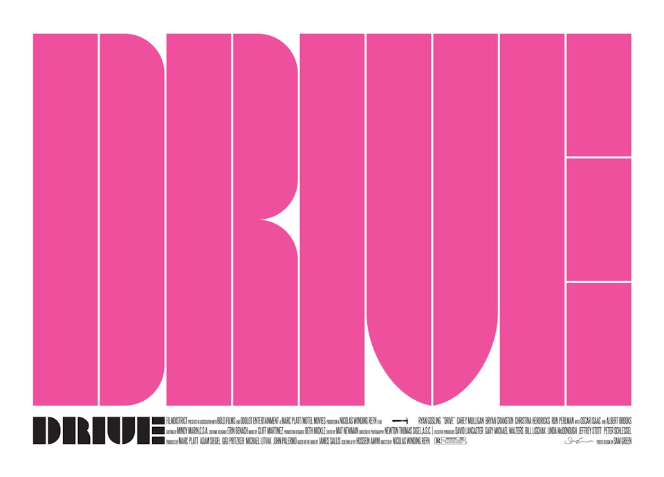
Drive Poster
Illustrated in Procreate, title design in Adobe Illustrator and coloured and assembled in Adobe Photoshop.
-
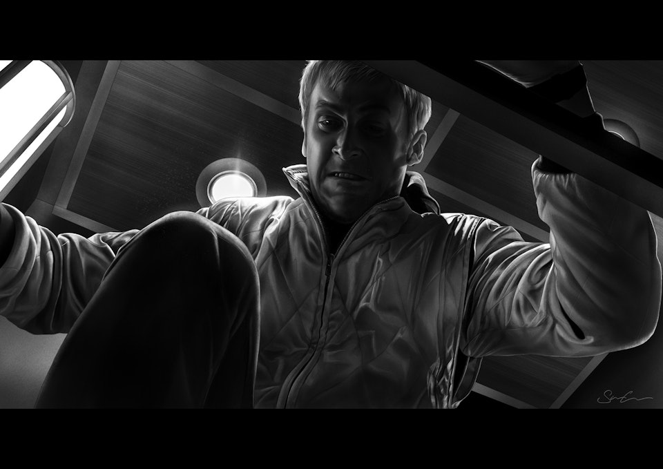
This study of the notorious elevator scene is the basis of the poster. A lot of the imagery/art for the film focuses on the scorpion, the scene with the hammer, or other bits of iconography - but one thing I never saw depicted was the elevator scene. The elevator scene is one of the most pivotal moments in the movie. The Driver finally reveals his true, violent self to Irene in order to protect her. But in doing so knowingly forfeits his chance to ever truly be with her. They have their first and last kiss before Driver brutally attacks the hitman, utlimately stomping his head into a bloody pulp as Irene looks on in horror, before she leaves the elevator and the doors close on them forever. It's a fantastic moment and so I chose to focus on that particular moment for my poster.
Illustrated in Procreate on iPad Pro.
-
Title design
Inspired by the work of Krzysztof Domaradzki, I wanted to create a poster with a big emphasis on the title block graphic element. I wanted to design a title that was readable of course, but that wasn't the only focus. I wanted to use the title as a framing device for the poster, and if you can't immediately read it that's absolutely fine - it's intended to capture the viewer and then allow them to take a step back and see it. I wanted something bold and eye catching first, readable second.
Designed in Adobe Illustrator
-
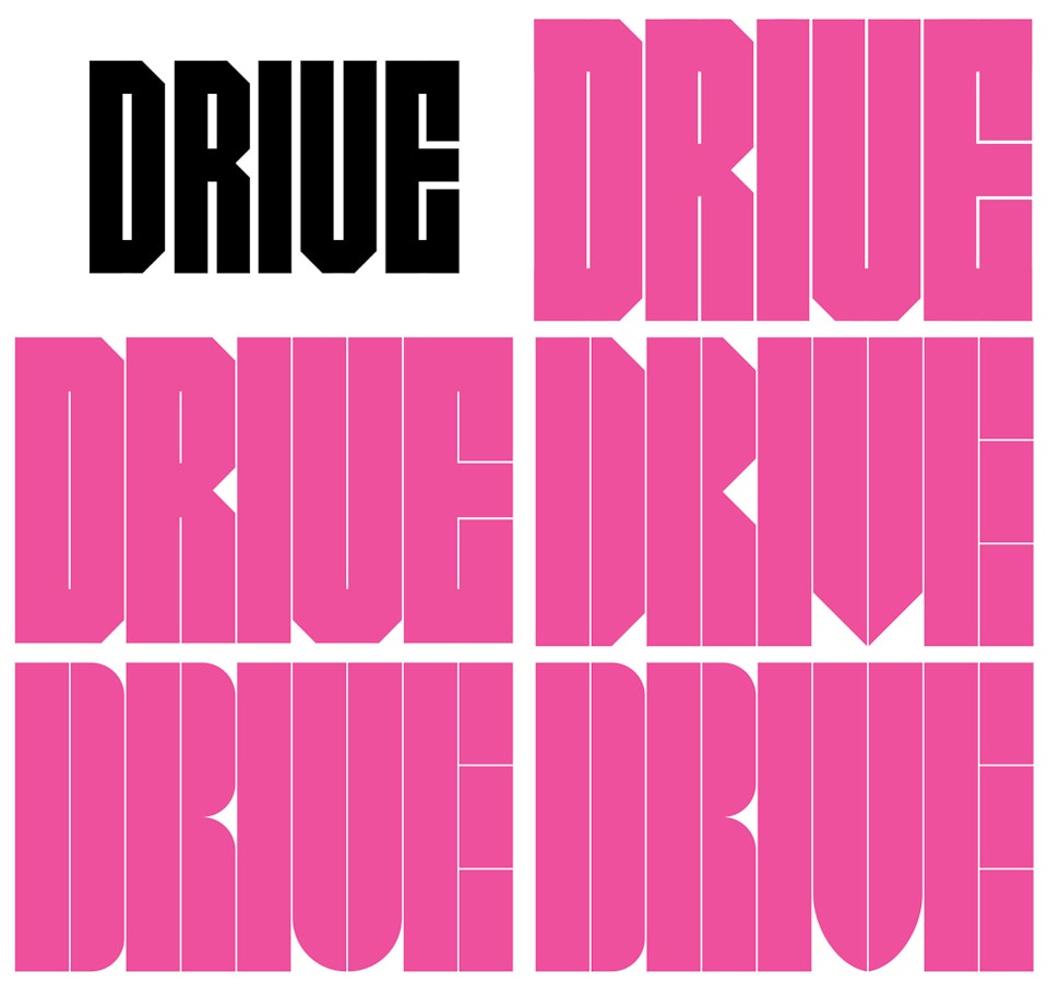
Early exploration for the title block.
Initially I was going for something more angular, before settling on a softer cornered approach. All right angled sections have the same roundness, although the V has been accentuated to make it read slightly more clearly as a V rather than a U. The spaces between characters and within them had to be extremely thin so as not to break up and obscure the image too much.
-
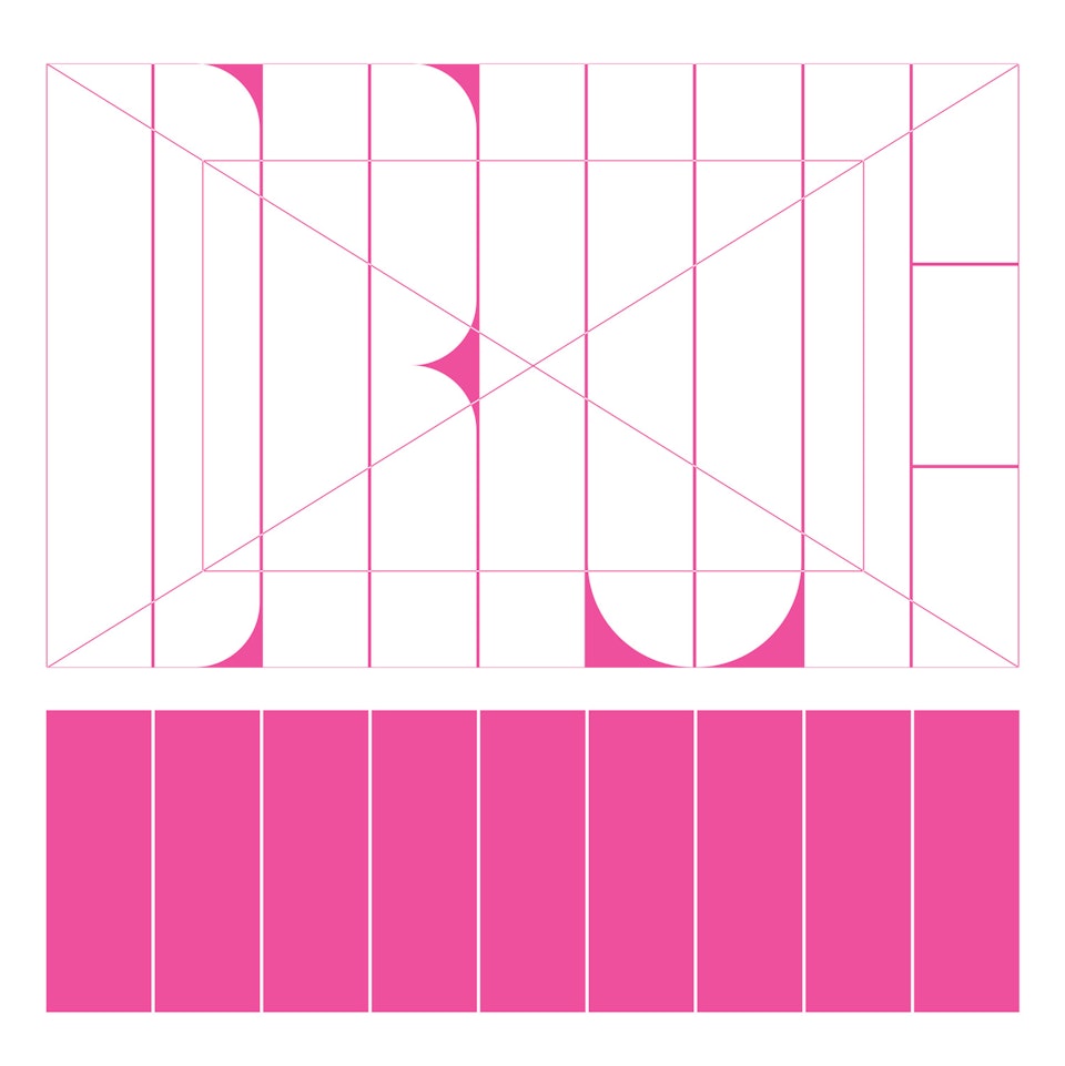
Exploration of shapes and proportion
-

Design exploration for the smaller title block that appears in the bottom left of the poster, dictating the proportions for the credits. The process for this was similar to the main block, at a reduced scale.'
Designed in Adobe Illustrator.


